Do you usually use a read-only and / or a disabled form control field to display plain text in a form? Both certainly have their usage but what’s the best way to handle that for accessibility and usability?
After some investigation, trial and error, we came up with two solutions for a better User Experience.
In our opinion, if you want to use a read-only field, you should style it since the look is kind of confusing. A disabled field does usually invoke the meaning that it can be disabled by a function or workflow part of the same page task.
Both do have different behaviors but in the end if you’re looking to display as a plain text, you should style it as a label while making sure accessibility and usability are considered. The only downside is if the field is empty, it might look a bit weird.
In summary, the reasons to style the read-only and/or disabled fields:
- Avoid confusion of why it is not editable
- As opposed to only display them as plain text because in form mode those are skipped by screen readers
- Aesthetically looks better
- Cross browser style consistency
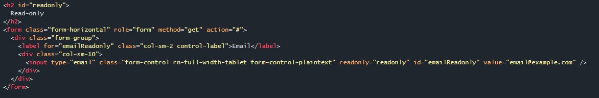
Read-only
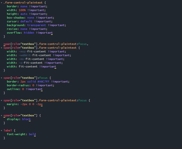
Here we keep the input text control with the read-only attribute but use CSS to style the look as a plain text. The disadvantage is if we have longer text, it will be cut in the display.
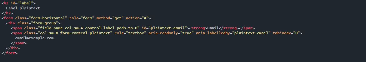
Plain text
Using just a plain text with a textbox role and focus z-index mimics the behavior of an input text control but with the look of a plain text
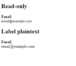
Result
We understand that these are potential solutions but it is up to you to decide if it is applicable to your particular context.